Dat is natuurlijk een grapje. In het commentaar onder de vorige blogpost over het jaarlijkse WMO Greenhouse Gas Bulletin blijkt dat de WMO met een toename van 2.9 ± 0.2 ppm CO2 over 2013 beduidend hoger uitkomt dan NOAA met 2.54 ± 0.09 ppm. De betrouwbaarheidsintervallen overlappen net niet. Het maakt nieuwsgierig en Dr. Guido van der Werf was zo vriendelijk om op onderzoek uit te gaan. Al binnen een dag had hij antwoord:
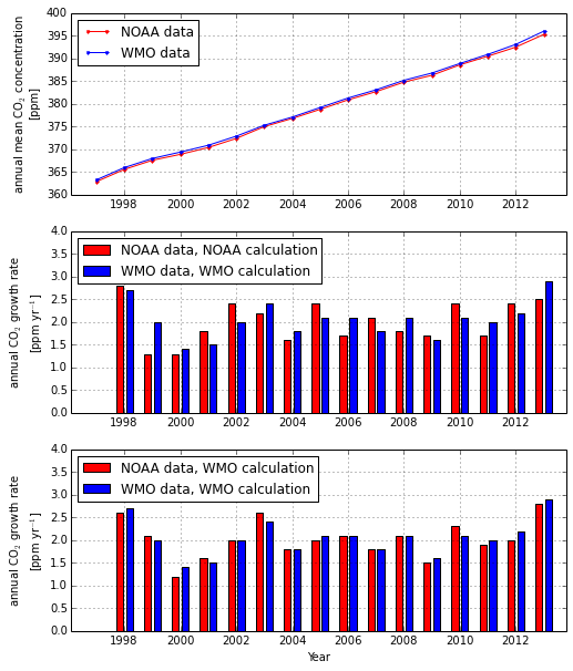
The difference between WMO (growth rate for 2013 of 2.9 ± 0.2 ppm) and NOAA (2.54 ± 0.09 ppm) is very large, especially when considering this is the best constrained part of the global carbon cycle. Pieter Tans (NOAA) and Wouter Peters (Wageningen University) helped out with understanding what is going on. There are two main differences: 1) WMO includes more CO2 measurement stations in their averaging procedure than NOAA, including many on land. NOAA refrains from doing that as the land stations may be more influenced by local processes thus not fully representing background conditions. Interestingly, including more land stations elevates the average concentration somewhat as emissions occur mostly on land (see top panel of this figure). 2) WMO calculates the annual growth rate as the difference between mean annual concentration of one year minus mean annual concentration of the previous year. NOAA does it different, they calculate it as the difference between mean concentrations on midnight of the 31st of December minus those of midnigh January 1st. The two basically have a 6 month offset. Combined, these two things lead to different results, see middle panel. By far the largest difference is due to the different ways of calculating the growth rate, if we would use the WMO approach but the NOAA data we get almost as high a growth rate in 2013 as WMO gets, see the bottom panel. pdf version of the graph is here